
Bika
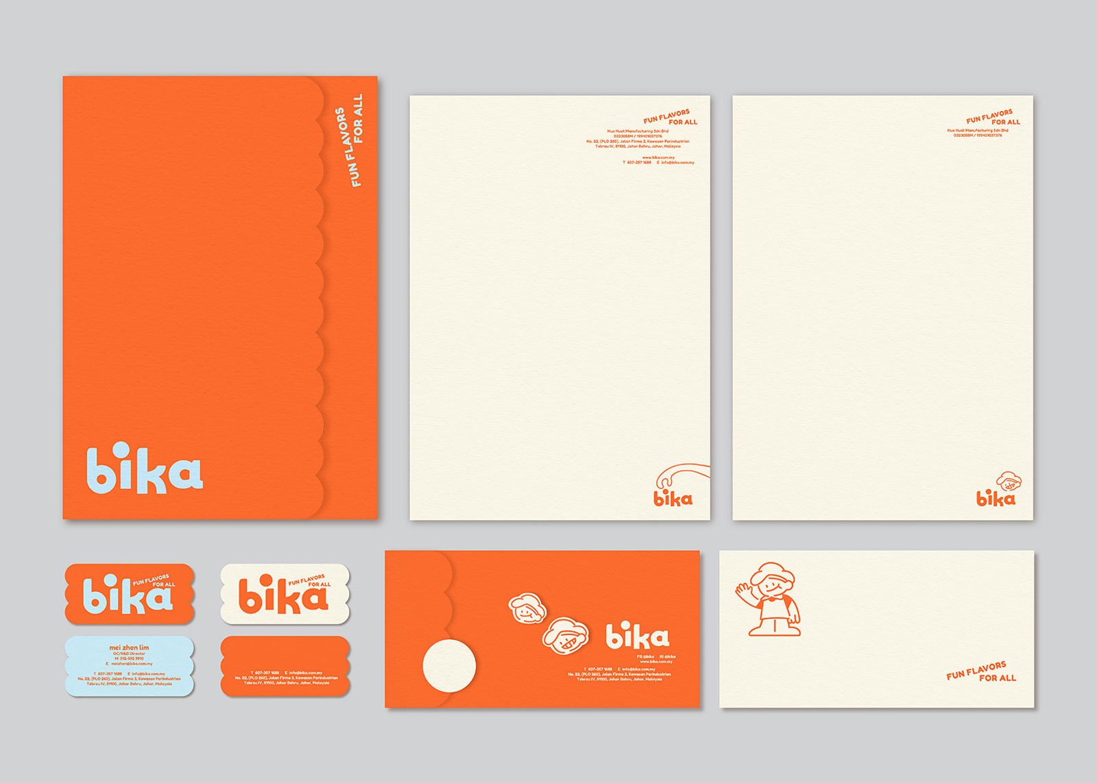
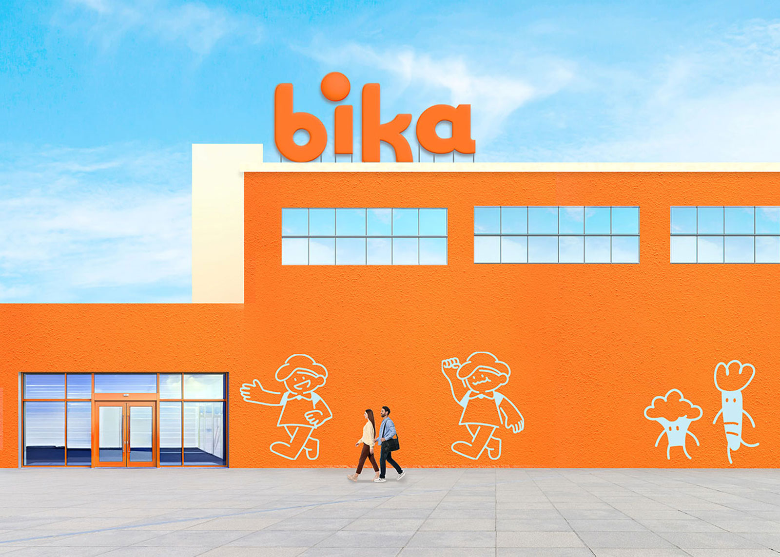
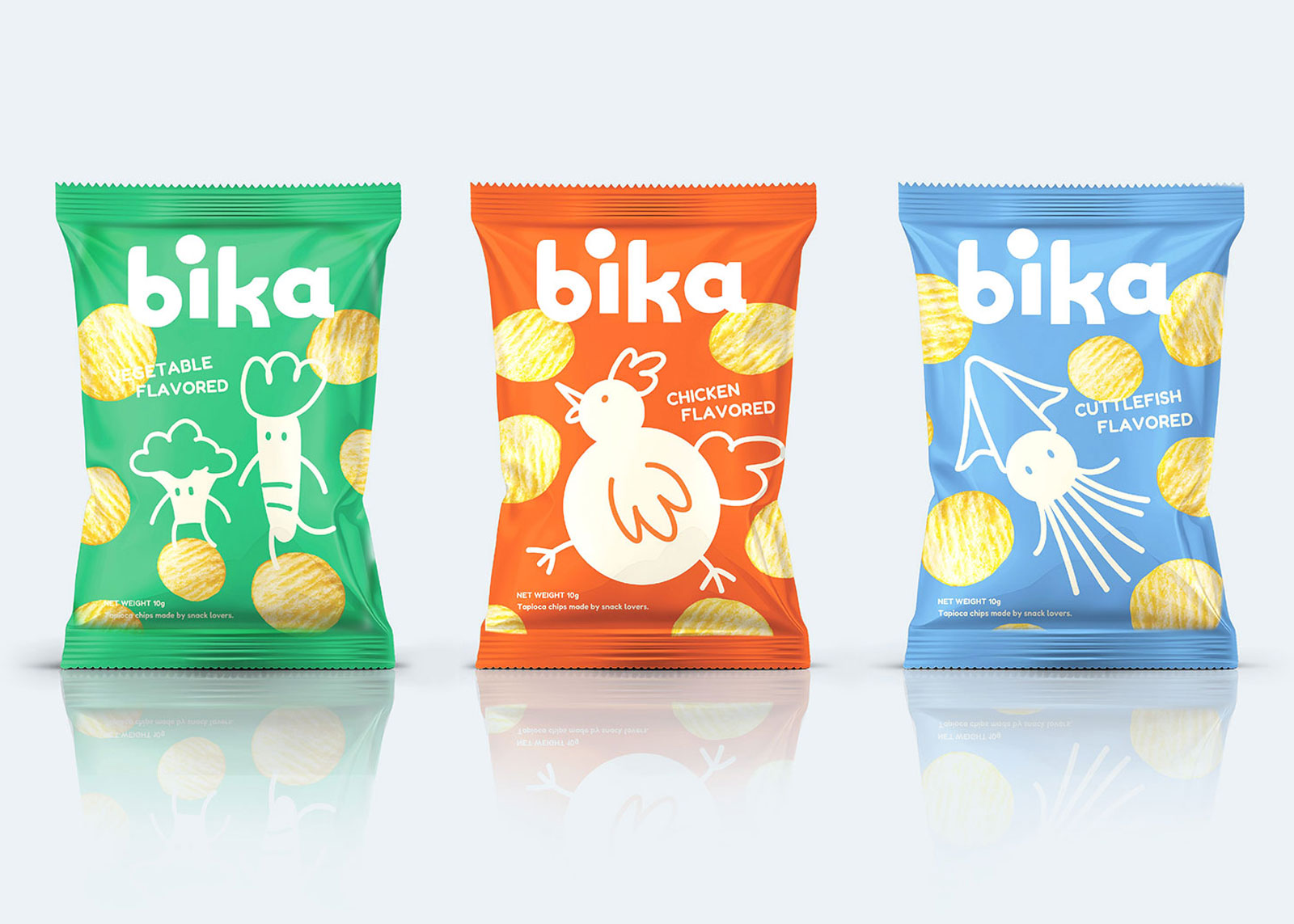
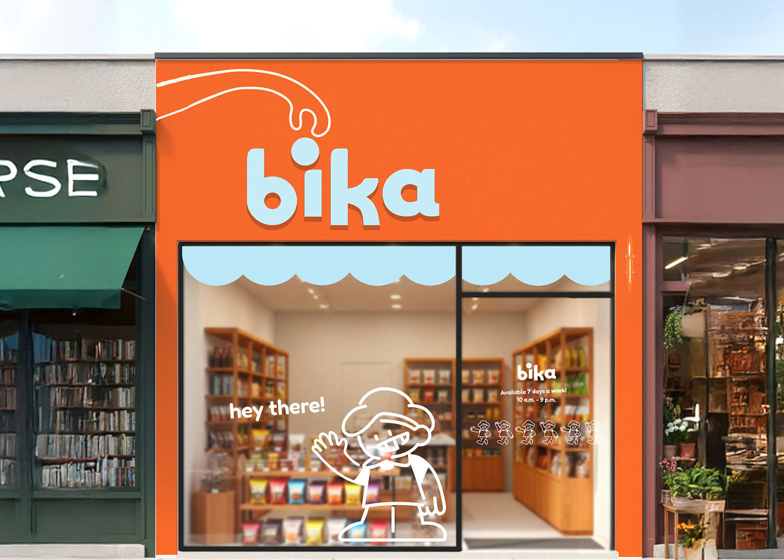
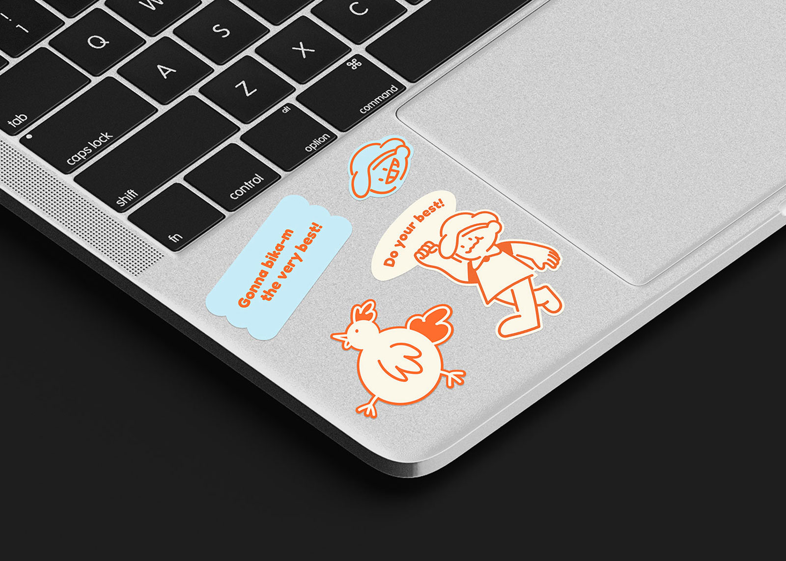
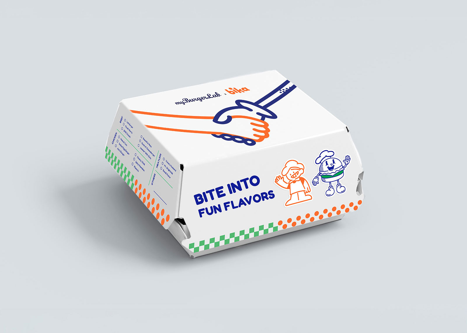
The new logo represents a friendly and approachable image through bold strokes and playful letter alignment while maintaining visual balance. The enlarged dot on the letter “i” is reimagined as a snack element, reinforcing the brand’s fun and tasty identity.

Scroll For More